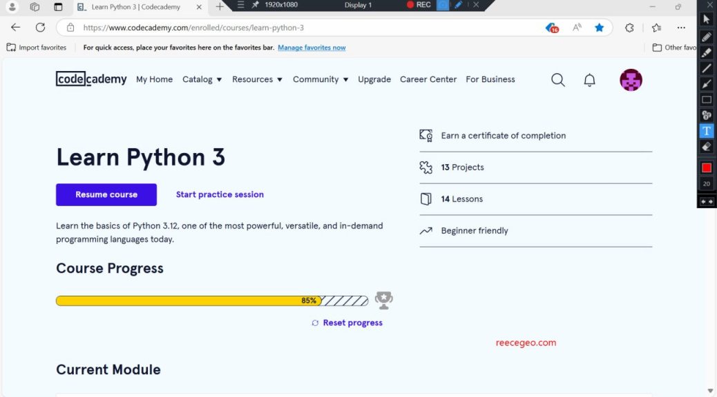
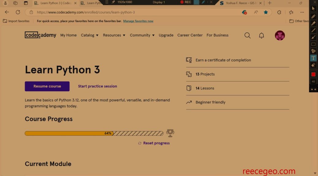
In this guided project, I used classes and object-oriented programming to create a system for a restaurant. This project was the last in a series of modules in the Learn Python 3 course by CodeCademy.
Since classes and object-oriented programming proved to be challenging concepts for me, I used the walk-through video to follow along with an experienced programmer. Even after completing the project, I don’t feel like I have an adequate understanding of classes. I plan to find other resources online to help me gain that understanding, because I know that classes are an important Python concept particularly for PyQGIS.
class Business:
  def __init__(self, name, franchises):
    self.name = name
    self.franchises = franchises

class Franchise:
  def __init__(self, address, menus):
    self.address = address
    self.menus = menus

  def __repr__(self):
    return self.address

  def available_menus(self, time):
    available_menus = []
    for menu in self.menus:
      if time >= menu.start_time and time <= menu.end_time:
        available_menus.append(menu)
    return available_menus

class Menu:
  def __init__(self, name, items, start_time, end_time):
    self.name = name
    self.items = items
    self.start_time = start_time
    self.end_time = end_time

  def __repr__(self):
    return self.name + ' menu available from ' + str(self.start_time) + ' to ' + str(self.end_time)

  def calculate_bill(self, purchased_items):
    bill = 0
    for purchased_item in purchased_items:
      if purchased_item in self.items:
        bill += self.items[purchased_item]
      else:
        print(f"Item {purchased_item} not found in menu.")
    return bill

#Brunch menu
brunch_items = {
  'pancakes': 7.50, 'waffles': 9.00, 'burger': 11.00, 'home fries': 4.50, 'coffee': 1.50, 'espresso': 3.00, 'tea': 1.00, 'mimosa': 10.50, 'orange juice': 3.50
}
brunch_menu = Menu('Brunch', brunch_items, 1100, 1600)

#Early Bird Menu
early_bird_items = {
  'salumeria plate': 8.00, 'salad and breadsticks (serves 2, no refills)': 14.00, 'pizza with quattro formaggi': 9.00, 'duck ragu': 17.50, 'mushroom ravioli (vegan)': 13.50, 'coffee': 1.50, 'espresso': 3.00,
}
early_bird_menu = Menu('Early Bird', early_bird_items, 1500, 1800)

#Dinner Menu
dinner_items = {
  'crostini with eggplant caponata': 13.00, 'caesar salad': 16.00, 'pizza with quattro formaggi': 11.00, 'duck ragu': 19.50, 'mushroom ravioli (vegan)': 13.50, 'coffee': 2.00, 'espresso': 3.00,
}
dinner_menu = Menu('Dinner', dinner_items, 1700, 2300)

#Kids Menu
kids_items = {
  'chicken nuggets': 6.50, 'fusilli with wild mushrooms': 12.00, 'apple juice': 3.00
}
kids_menu = Menu('Kids', kids_items, 1100, 2100)

menus = [brunch_menu, early_bird_menu, dinner_menu, kids_menu]

flagship_store = Franchise('1232 West End Road', menus)
new_installment = Franchise('12 East Mulberry Street', menus)

basta = Business("Basta Fazoolin' with my Heart", [flagship_store, new_installment])

#Arepa

arepas_items = {
  'arepa pabellon': 7.00, 'pernil arepa': 8.50, 'guayanes arepa': 8.00, 'jamon arepa': 7.50
}
arepas_menu = Menu("Take a' Arepa", arepas_items, 1000, 2000)

arepas_place = Franchise("189 Fitzgerald Avenue", [arepas_menu])

arepa = Business("Take a' Arepa", [arepas_place])
